Posters For Parks
ILLUSTRATION // PRINT // PHOTOGRAPHY
Posters for Parks is an annual show featuring limited-edition posters inspired by Minneapolis Parks. The event is a joint venture of LoveMplsParks.org and the People for Parks Foundation. 50% of all profits from the show are donated to the People for Parks Foundation to protect and preserve the award-winning Minneapolis park system.
The poster show raises thousands of dollars every year for the foundation, helping fund incredible local projects that bolster the community and the environment. If you'd like to learn more about Posters for Parks, check out lovemplsparks.org for more details.
Credits:
SHOW ORGANIZER: DAN WOYCHICK
PHOTO ASSISTANCE: BRENT SCHOEPF
FOIL STAMPING: STUDIO ON FIRE, MCINTOSH EMBOSSING
SILKSCREEN PRINTING: AMBIENT INKS
MY ROLE: ILLUSTRATOR


National Pine
“National Pine” is a love letter to midwestern simplicity. One of the main challenges for this piece was evoking a sense of warmth and familiarity through color and tone, but also recreating a sense of place that people would recognize. This piece revolves around the sensibility that even in the coldest landscapes, you can still find warmth and comfort.
Bridge of Lights
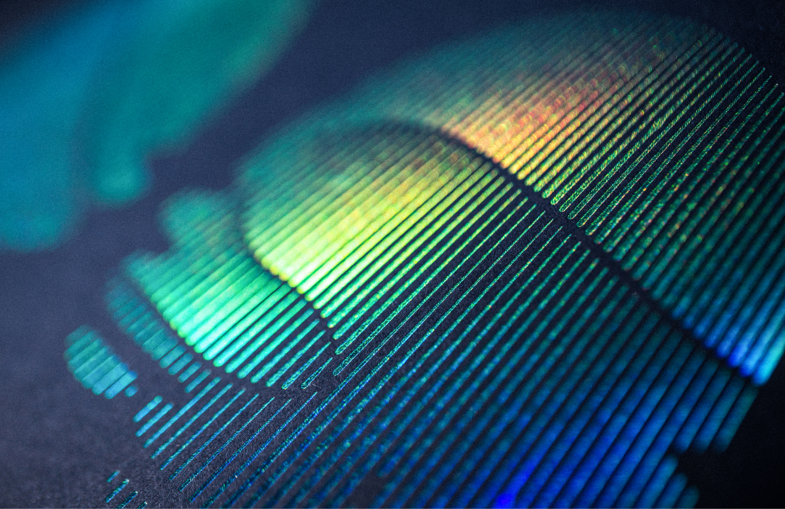
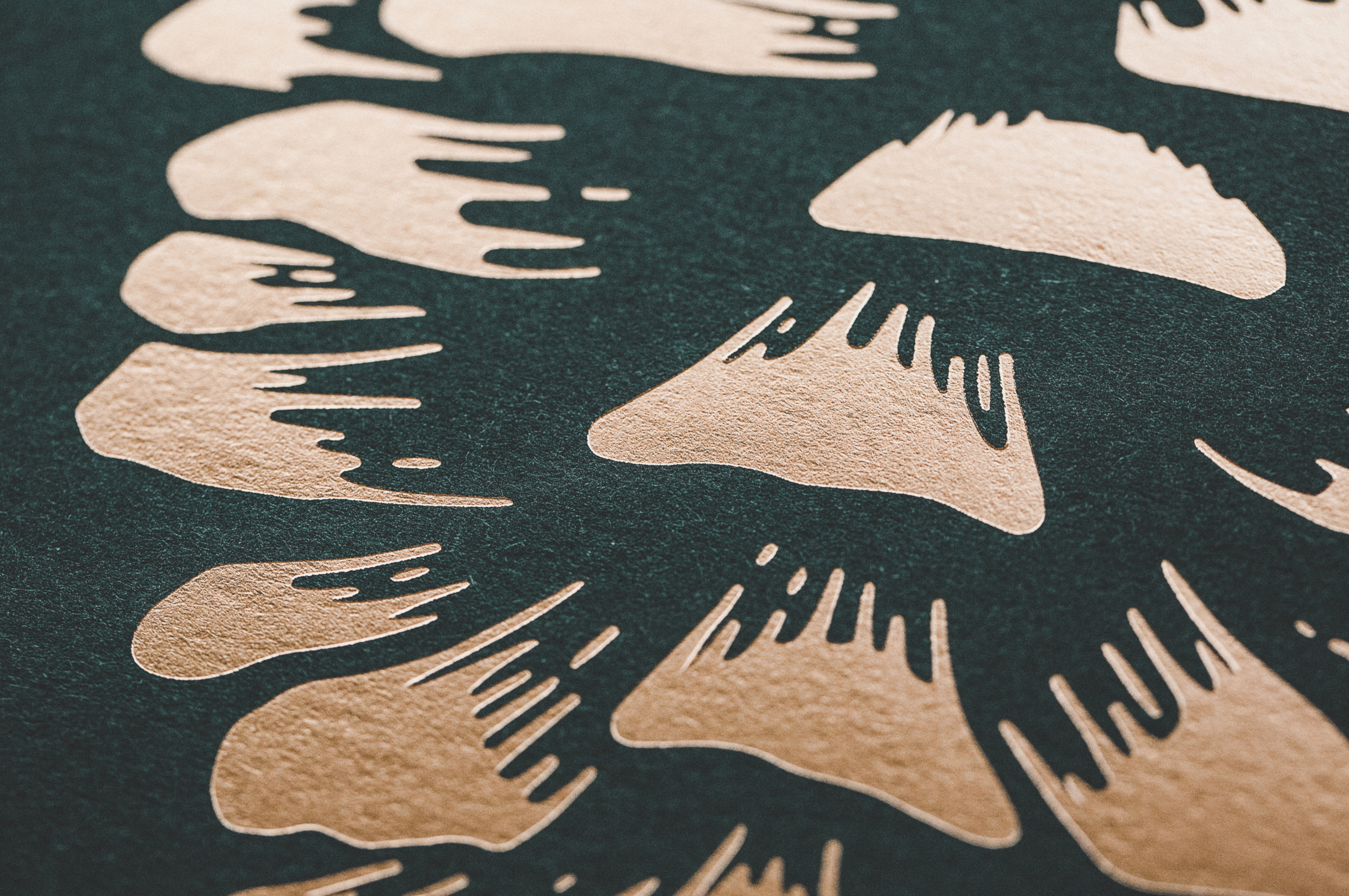
For the 2017 Posters for Parks show, I wanted to visualize the unique nature of the northern lights through material and light distortion. To achieve this effect, we used a holographic foil that mimicked the multicolor nuances of the auroras. Inspired by the arches of the Stone Arch Bridge in Minneapolis, the circles create a form through negative space in which your perspective is challenged to build a picture around the shifting light fragmentations, therefore enhancing the sense of discovery.


The Great
Northern Diver
Living as an artist in Minnesota, it is almost a right of passage to create something revolving around loons. There are many loon posters floating around already, so for the 2018 poster show, I wanted to make this loon rendition a bit different by using hypnotic blends and bold color choices. The end result is perhaps a bit more stark in nature, but for those that know the iconic wail of the great northern diver, it is anything but subtle.


Change
In 2019, I was exploring the use of colors a bit more in my work. I had just gotten back from a camping trip on the north shore of Minnesota, the colors and atmosphere inspired me to try to capture some of that feeling that only midwest autumns can create.
There are still a number of leftovers from this gallery. Please email cjpetts@gmail.com if you’d like to inquire about a poster purchase.


Wild Oars
A few summers back, I was walking through an outdoor art show along the Mississippi River when I stumbled across a tent with hand crafted oars. The wood utilized in these oars were remnants of dilapidated Minneapolis buildings. The duality of this artistry inspired me to create a poster that combines the wondrous Minnesota natural landscapes with a commonplace local activity.


The Navigator
In 2021, some friends and I went on a long kayaking trip in northern Wisconsin. We found ourselves paddling for hours down a secluded little river in the middle of nowhere. It was incredibly freeing to plot our own course and navigate those wild waters. These experiences inspired me to find duality with both vessel and navigation to recreate that adventurous feeling.


State Park
For the 2022 poster show, I took a step back from my typical earth-toned style to create something a bit more loose and playful in nature. This poster is inspired by one of my favorite Minnesota parks, Tettegouche State Park. With incredible views of Lake Superior and some of the best hiking trails around, it’s no wonder why Tettegouche is a consistent favorite amongst Minnesotans.


Guiding Light
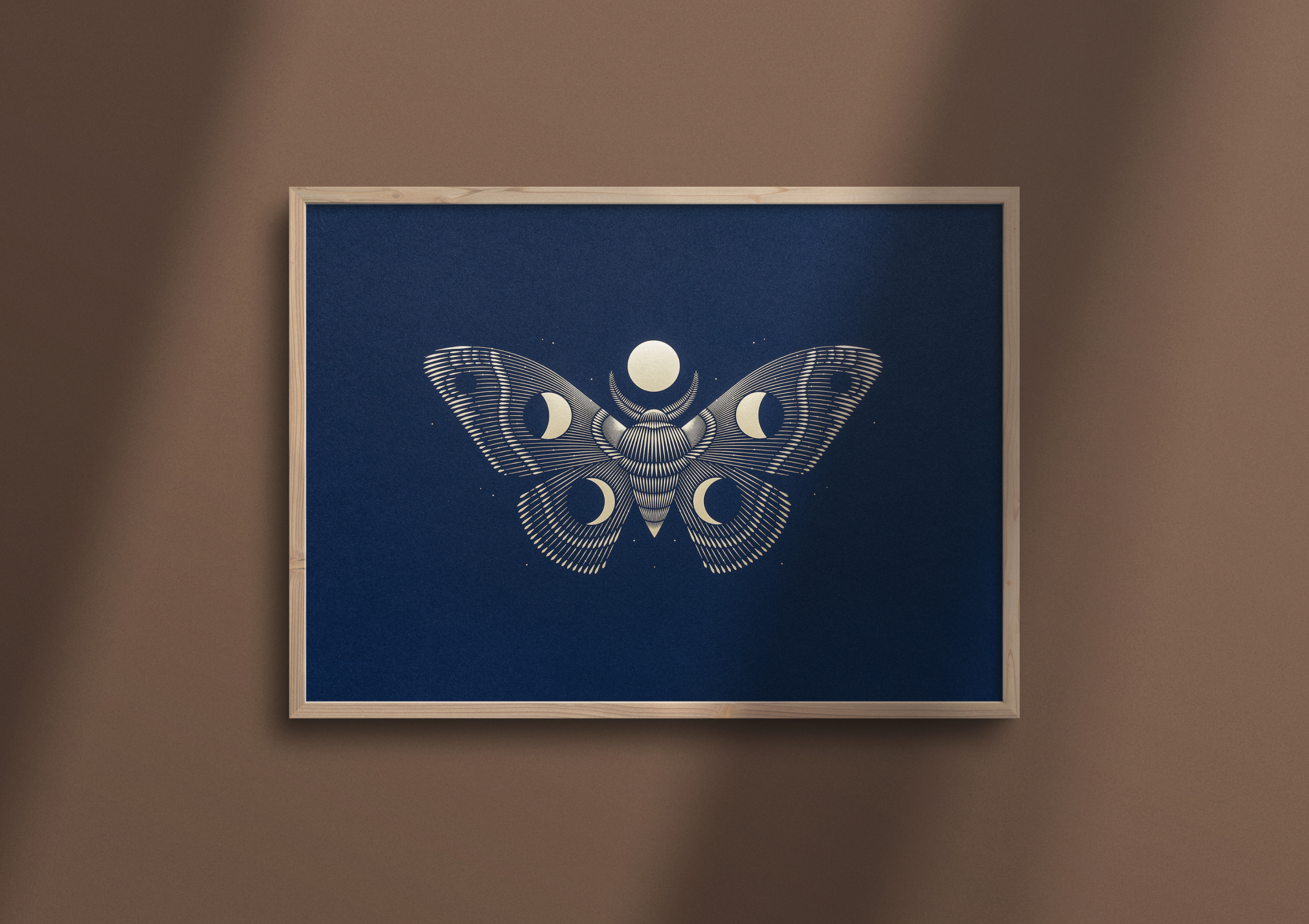
There’s an interesting theory that says moths use the light of the moon to navigate in the dark, hence why they’re attracted to light. They use it as a guidepost, much in the same way travelers use the North Star. For the 2023 poster show, I explored this concept with materials that are reminiscent of the night sky.


